Hi!

I'm Michel — a brand, graphic and UX/UI designer,
I create designs that work for you...
Let's Talk

Contact Information

Una Pizza

Industry

Food & Beverage

Role

Branding, Design, Brand Strategy, UX/UI

Location

Tripoli

Brand overview

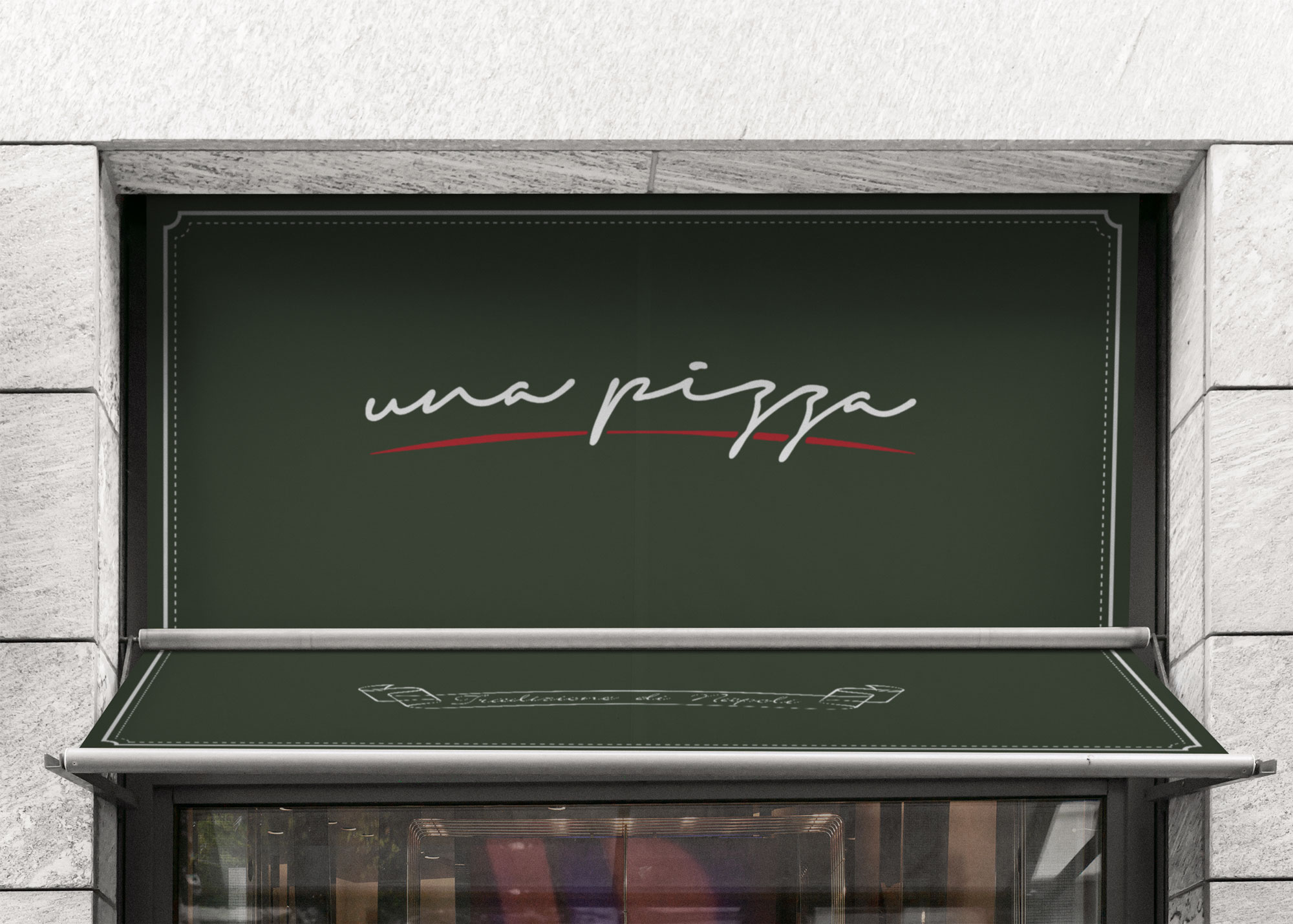
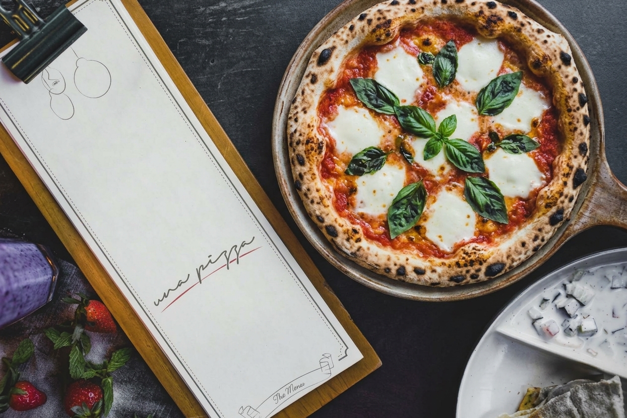
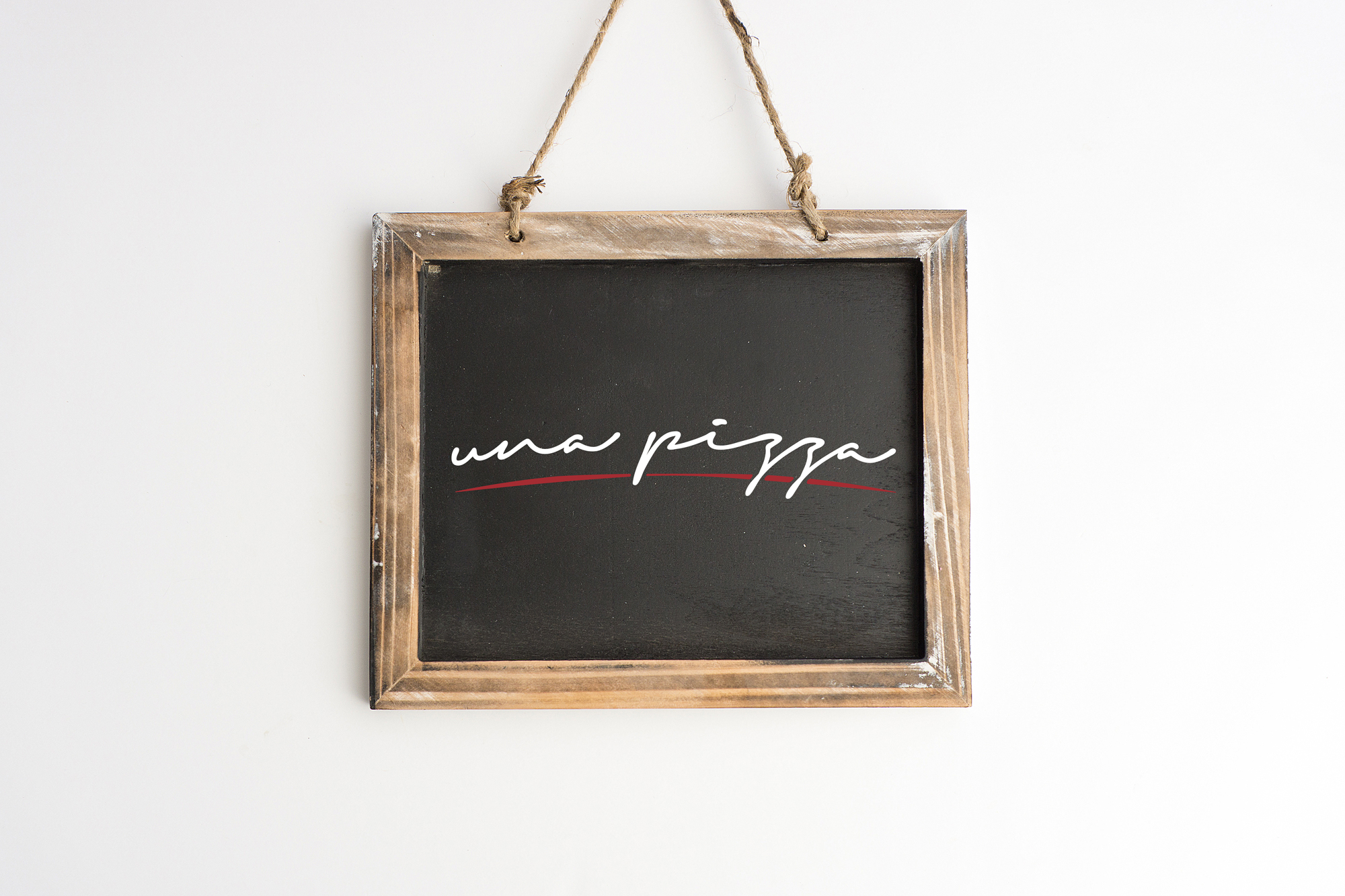
Una Pizza is a Neapolitan pizzeria built on one idea: a pizza, made properly. The identity avoids the usual red-white-and-green clichés and instead takes its cue from the trattoria chalkboard. Hand-drawn ingredient illustrations, stitched dashed borders and a handwritten wordmark with a single red sauce-like stroke give the brand a warm, crafted and slightly cheeky personality.

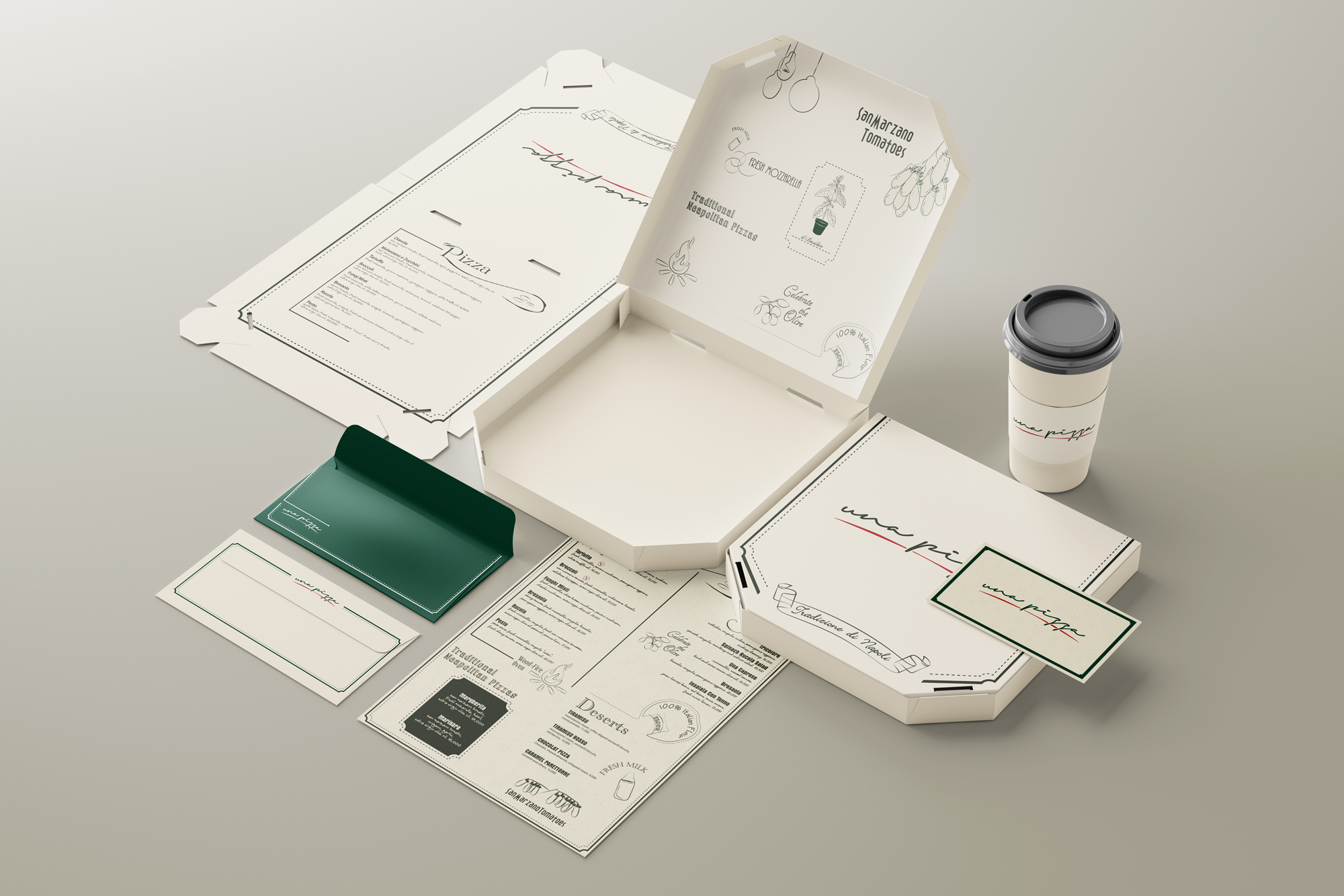
Deep forest green anchors the system, warm cream carries the print, and tomato red is used sparingly for impact. Italian captions such as il Basilico and Forno a Legna keep it authentic, with plain English alongside so it never feels exclusive.

The Challenge

Neapolitan pizza is a crowded category, and most brands lean on checked tablecloths, flag colours and stock imagery. Una Pizza needed to:

• Signal craft and tradition without looking dated
• Put ingredients and process at the centre of the story
• Be flexible enough for signage, menus, packaging and posters
• Have personality and a sense of humour, not just a logo on a green background

Scope of Work

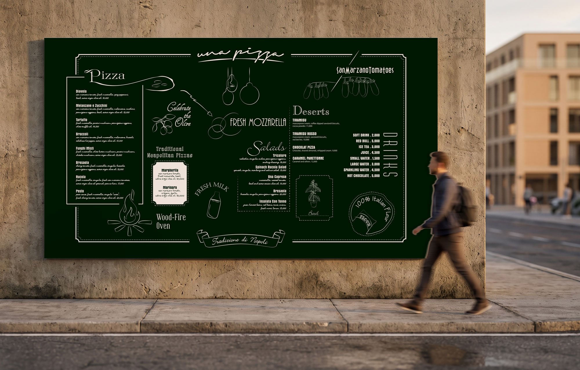
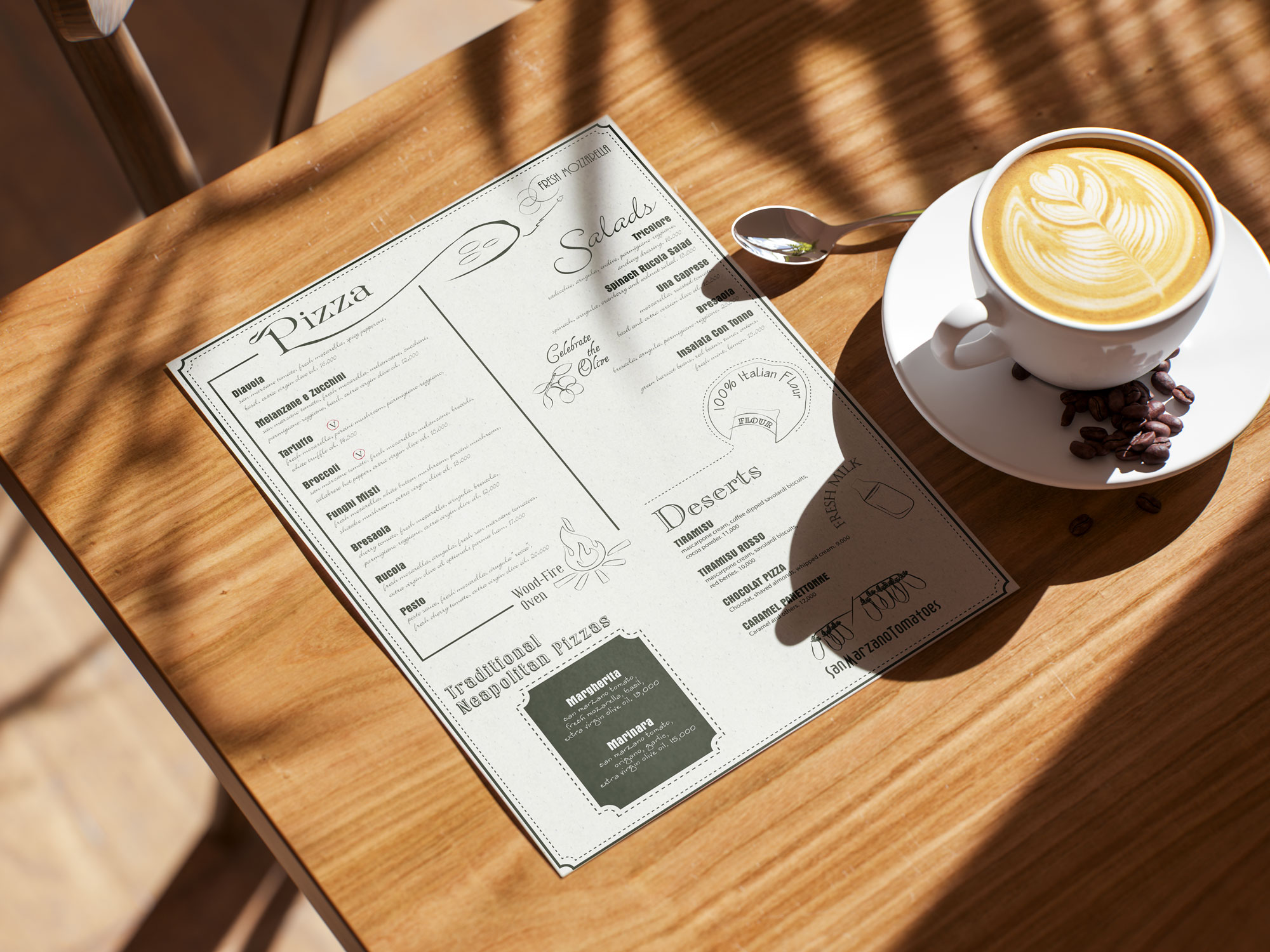
A cohesive identity that works from a coffee sleeve to a wall-sized menu, with a modular illustration language that lets the restaurant add specials, packaging or social content without losing consistency.

01. Concept Design

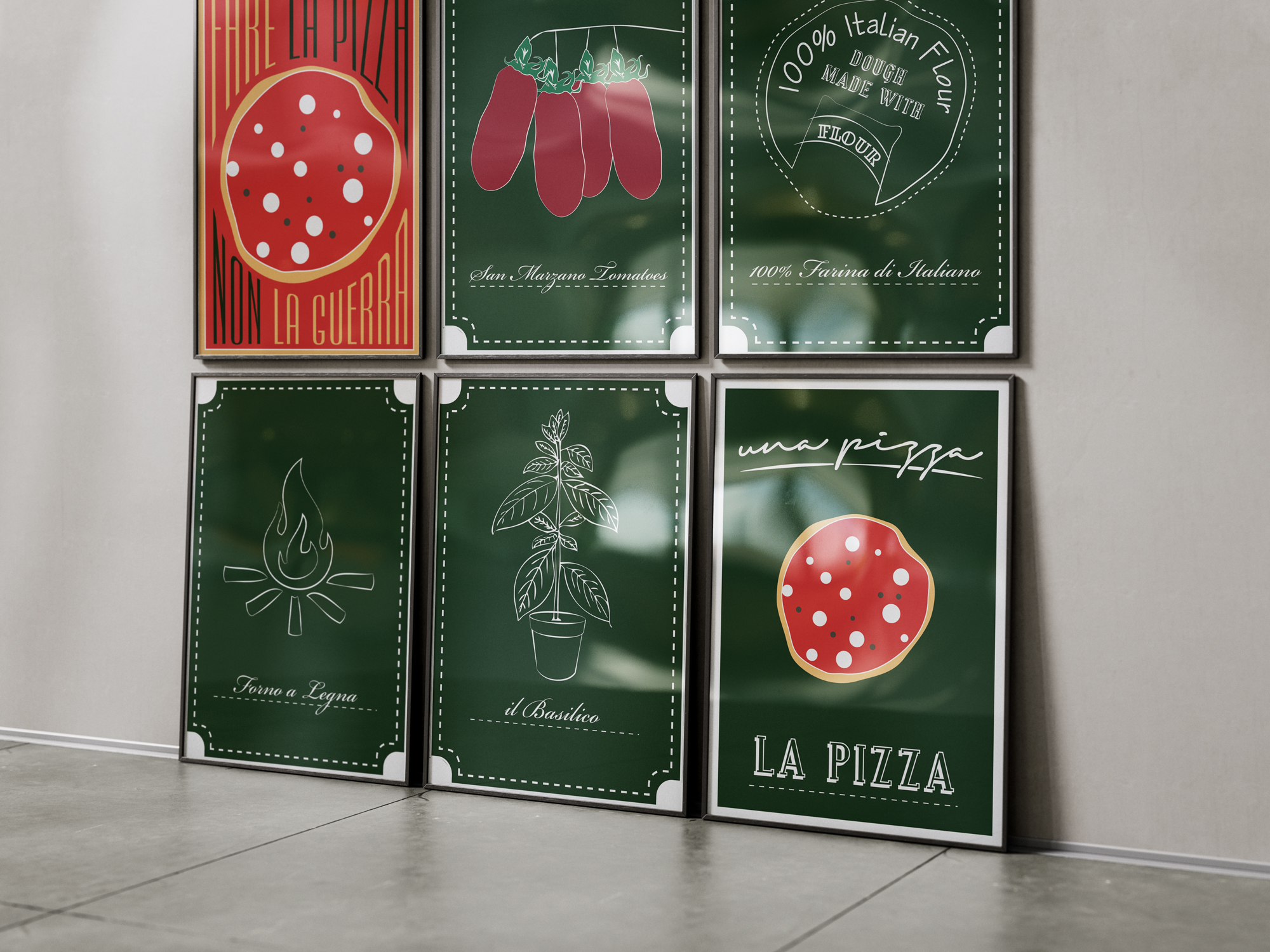
The concept is the chalkboard kitchen. Every pizzeria in Naples has a menu scrawled on a board, ingredients sketched by hand and a sense that someone is cooking in front of you. I translated that into a design language of chalk-style line illustrations on deep green, stitched dashed borders and handwritten lettering.

Ingredients are the heroes. Instead of photography, each hero ingredient gets its own hand-drawn illustration and a caption in Italian, so the brand tells its story the way a nonna would explain a recipe.

02. Visual Identity

Logo. The wordmark is a fluid, handwritten script, as if signed by the pizzaiolo. A single red brushstroke runs beneath it, passing through the descenders. It reads as the sweep of tomato sauce and gives the mark a distinctive, ownable shape. The logo works in white on green, in dark on cream and as a small mark on cups and cards. Colour. The palette is deliberately restrained: Forest green, a deep chalkboard tone that anchors signage, posters and envelopes Warm cream, a paper-like neutral for menus, boxes and stationery

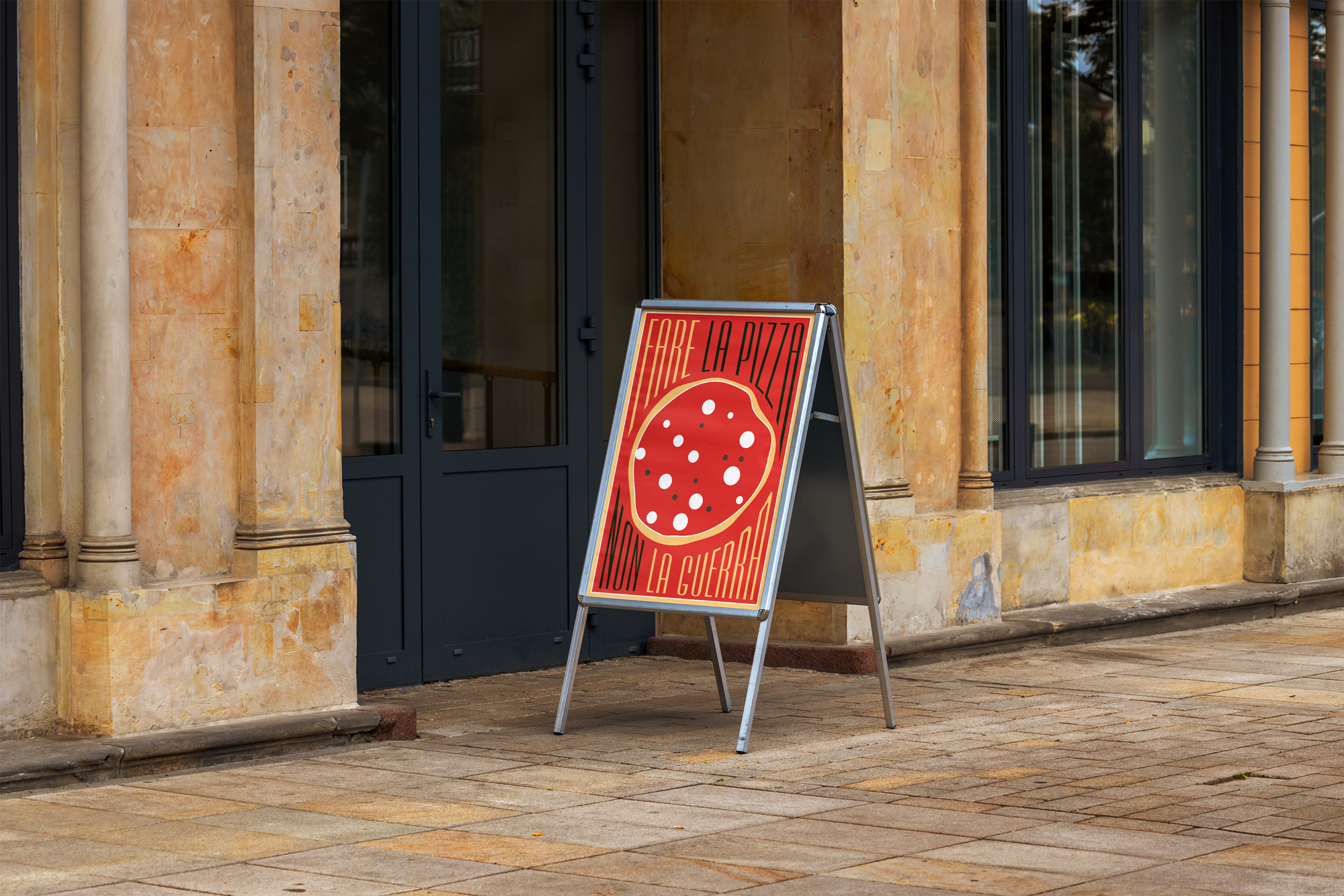
Tomato red, used sparingly for the logo stroke and for high-impact moments such as the poster Golden crust, an accent for the pizza illustrations

03. Typography

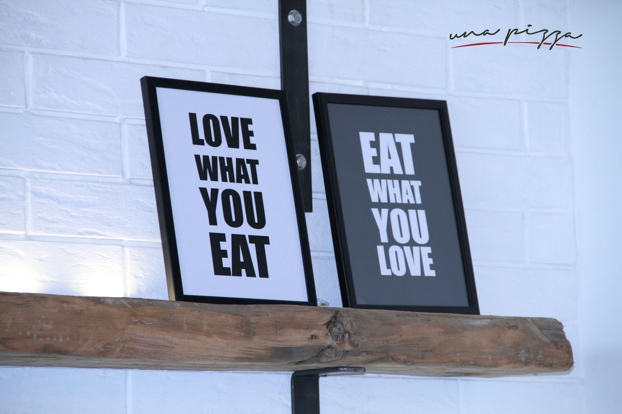
A mix of voices, each with a role: a handwritten script for the logo and expressive moments, an elegant calligraphic italic for ingredient captions, a vintage serif display for section titles like Pizza, Salads and Deserts, and tall condensed lettering for the bold poster statements. Together they feel collected and characterful, like a well-loved kitchen rather than a corporate template.

04. Illustration

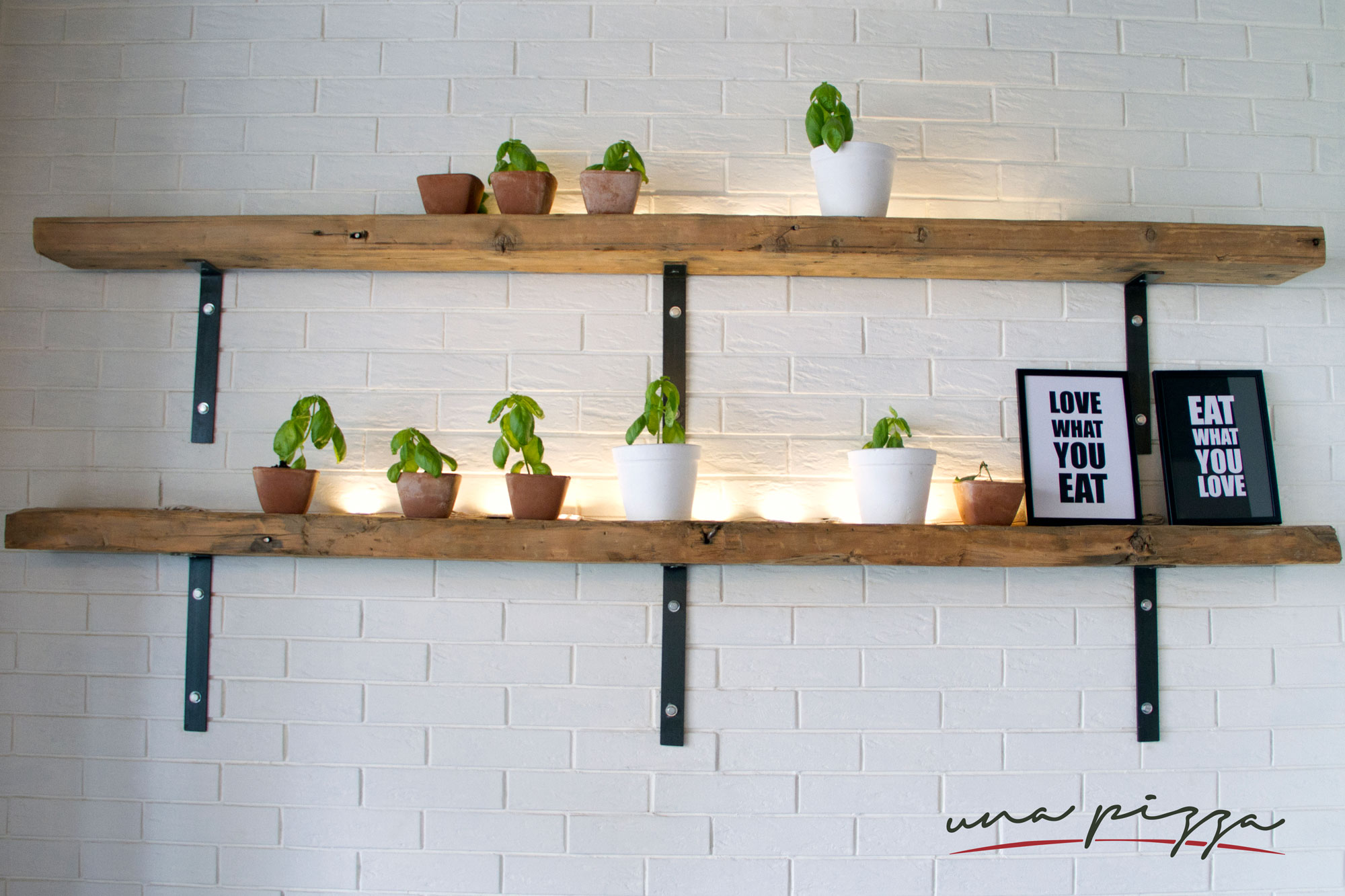
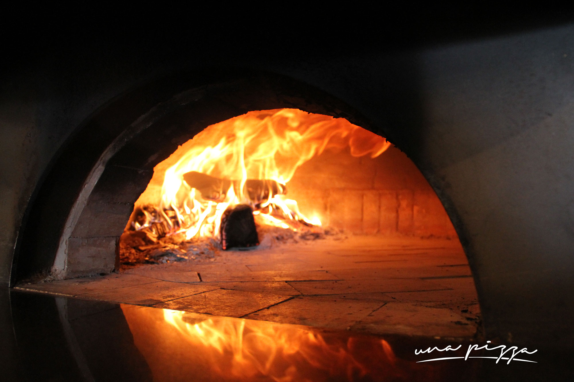
A custom set of line illustrations forms the heart of the system: hanging San Marzano tomatoes, a potted basil plant, a wood-fire flame, a flour sack, olives, a milk bottle, mozzarella and pendant bulbs. All share the same line weight and chalk feel, so they can be mixed freely across layouts.