I'm Michel — a brand, graphic and UX/UI designer,
I create designs that work for you...
Let's Talk
Building a Distinctive Corporate Identity for an International Brand Portfolio
Phoenicia Group is a diversified international business operating across the beverage and FMCG sectors, with a strong portfolio of international spirits, wine and beer brands.
The company required a distinctive corporate identity that could establish Phoenicia as a credible group brand in its own right, while providing a consistent visual language across its corporate communications and business materials.
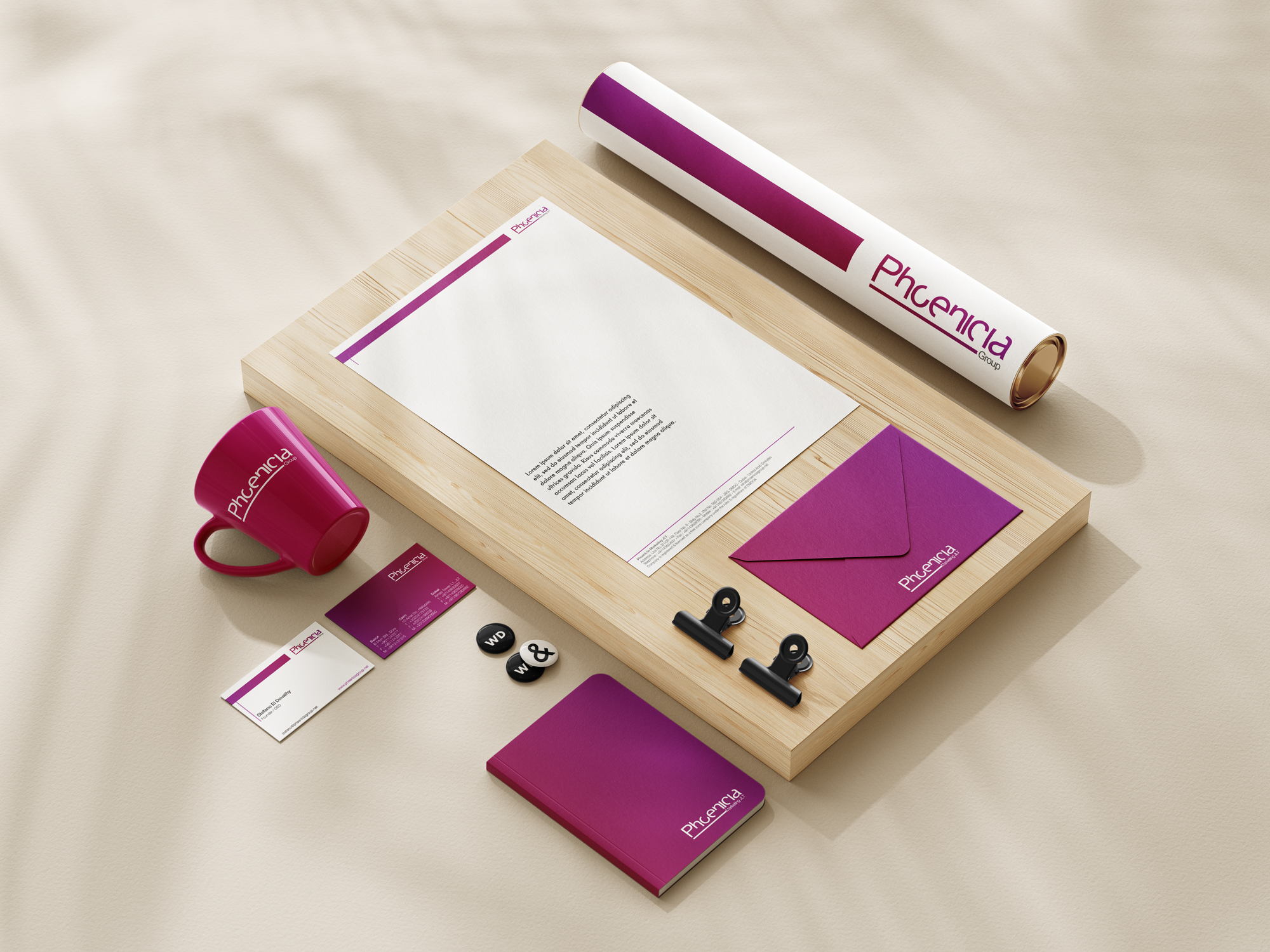
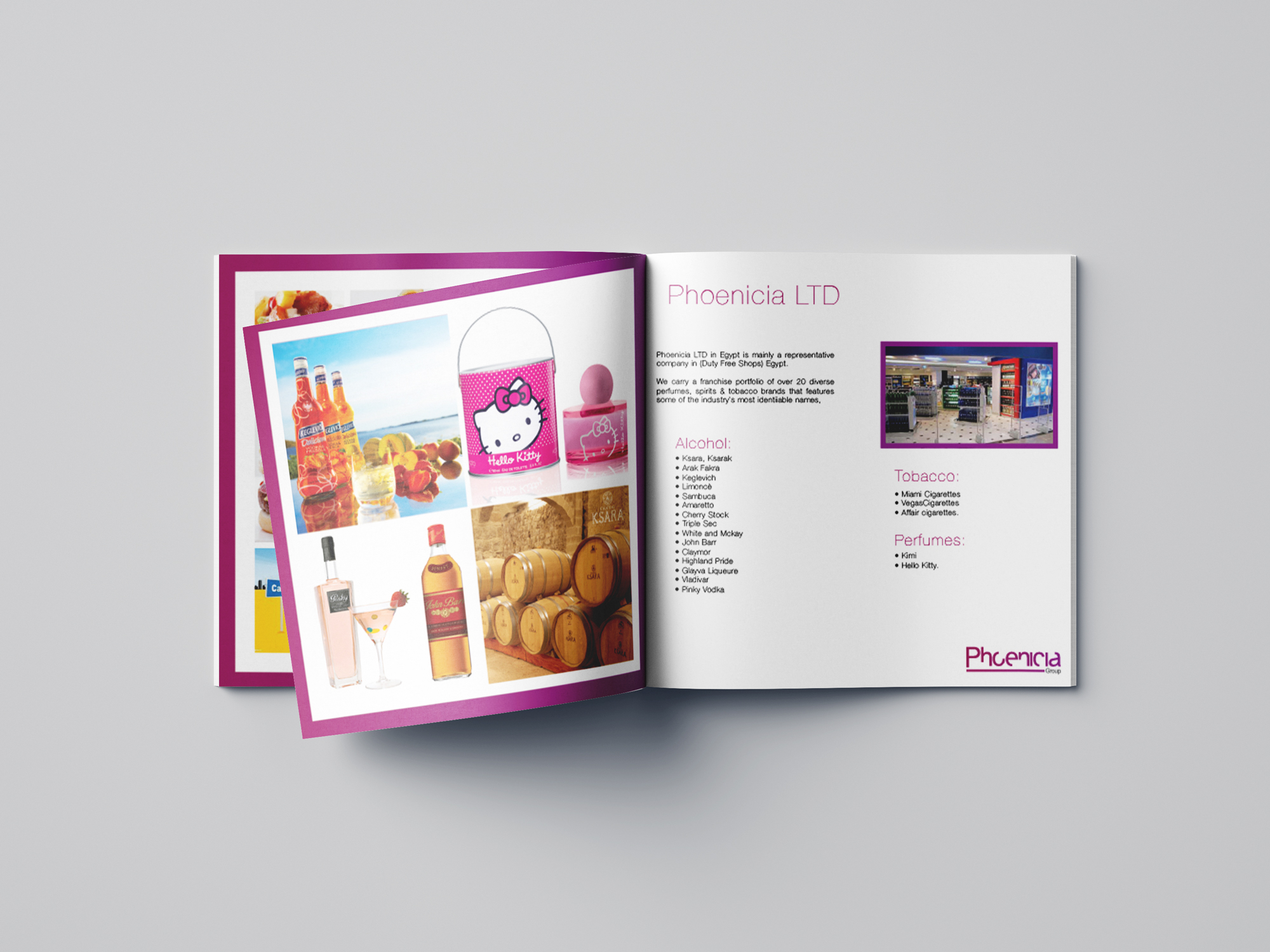
The project began with the development of the Phoenicia Group logo and visual identity, and evolved into a broader corporate branding system covering stationery, presentations, company profiles and marketing collateral.

Phoenicia Group is a diversified international business operating across the beverage and FMCG sectors, with a strong portfolio of international spirits, wine and beer brands.
The company required a distinctive corporate identity that could establish Phoenicia as a credible group brand in its own right, while providing a consistent visual language across its corporate communications and business materials.
The project began with the development of the Phoenicia Group logo and visual identity, and evolved into a broader corporate branding system covering stationery, presentations, company profiles and marketing collateral.
The identity needed to communicate several characteristics simultaneously:
• Corporate credibility and professionalism
• An international and contemporary outlook
• The premium nature of the brands represented by the group
• A sense of confidence and distinction
• Flexibility across multiple business sectors and communications
• A visual system capable of working alongside numerous third-party brands
Rather than creating an identity that competed with the brands in Phoenicia's portfolio, the objective was to establish a strong corporate master brand that could sit confidently behind them.
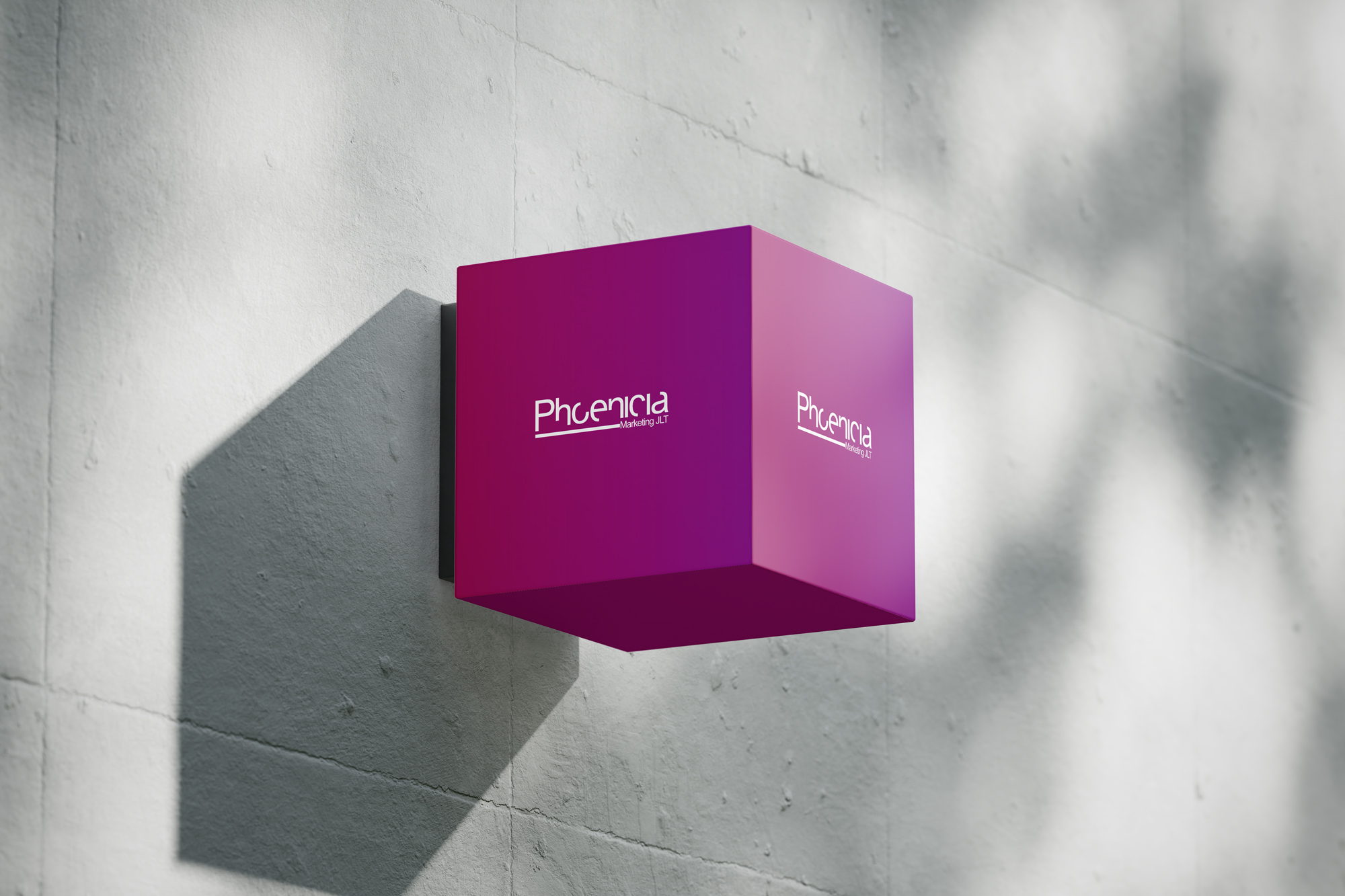
The creative direction centred around a distinctive magenta / plum colour palette, combined with clean typography, generous white space and strong graphic framing.
The result was a visual identity that felt:
Modern · Premium · Confident · Distinctive · International
The colour became an important part of the brand recognition, allowing Phoenicia to maintain a strong visual presence across very different applications.
The identity was designed to be both corporate and approachable, avoiding the conventional visual language often associated with traditional trading and distribution companies.